Rebel Efficiency Charts
Here we will keep and attempt to update the Rebel efficiency and wound by target charts.
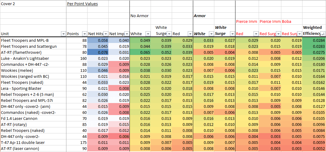
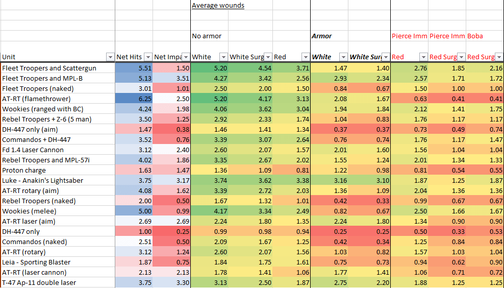
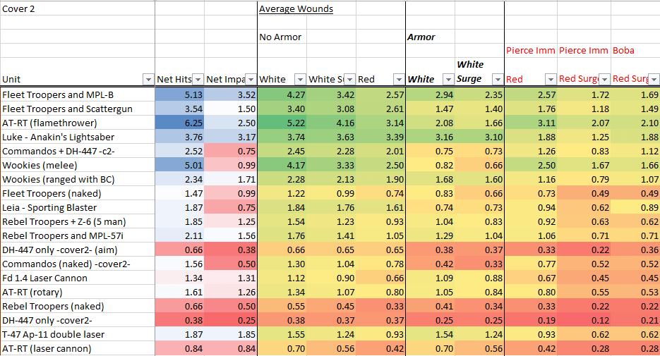
Not every single load-out is shown, just the common ones. Blue/green is good (high wounds/efficiency), red is bad (low wounds/efficiency). For an explanation of what these charts demonstrate and why they are important, please read the Intro article here: Risk Management and Efficiency.
Kyle added a column to the efficiency charts called Weighted Efficiency. This is just a given unit/weapons (non-impact wounds [red die] x 2/3) + (impact wounds [white with surge] x 1/3). So basically it weights non-impact wounds at 66% and impact wounds at 33%. The charts are sorted (descending) based on this value. If you want much more detailed breakdowns of the units and their loadouts, please visit the Unit Guides.
No Cover
Wounds by target, no cover:
Wounds/Hits per point, no cover:
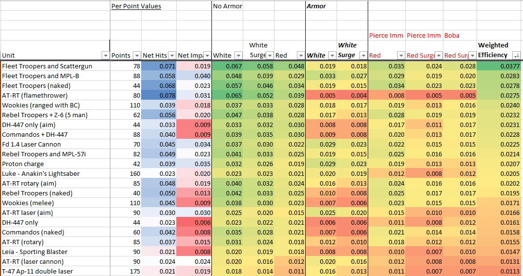
Cover 2
Wounds by target, cover 2:
Wounds/hits per point, cover 2: